What is Countly?
Countly is a plugin-based product analytics platform that helps organizations track their product's performance and user data across all platforms. With its numerous features, it allows users gain in-depth insights and improve their products accordingly.
Problem
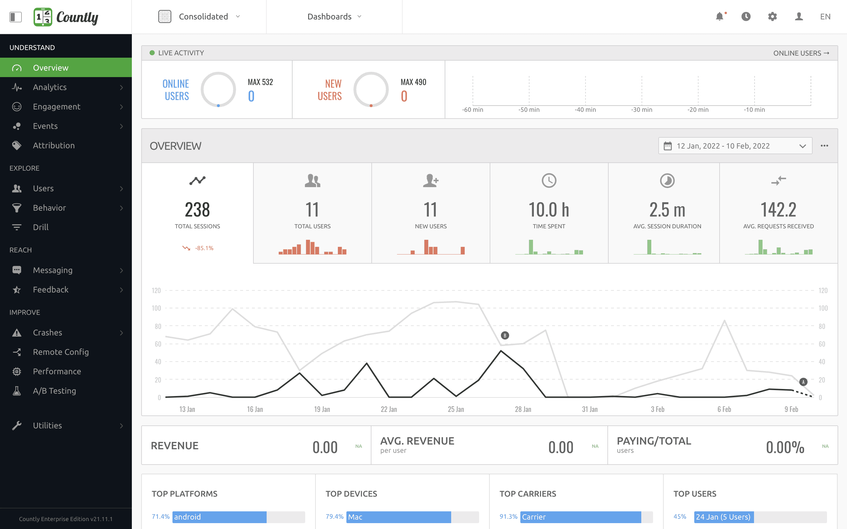
The platform's design hasn't undergone any major design overhauls since its launch 8 years ago. Its outdated user experience has caused a competitive disadvantage, making it unattractive to both current and prospective customers.
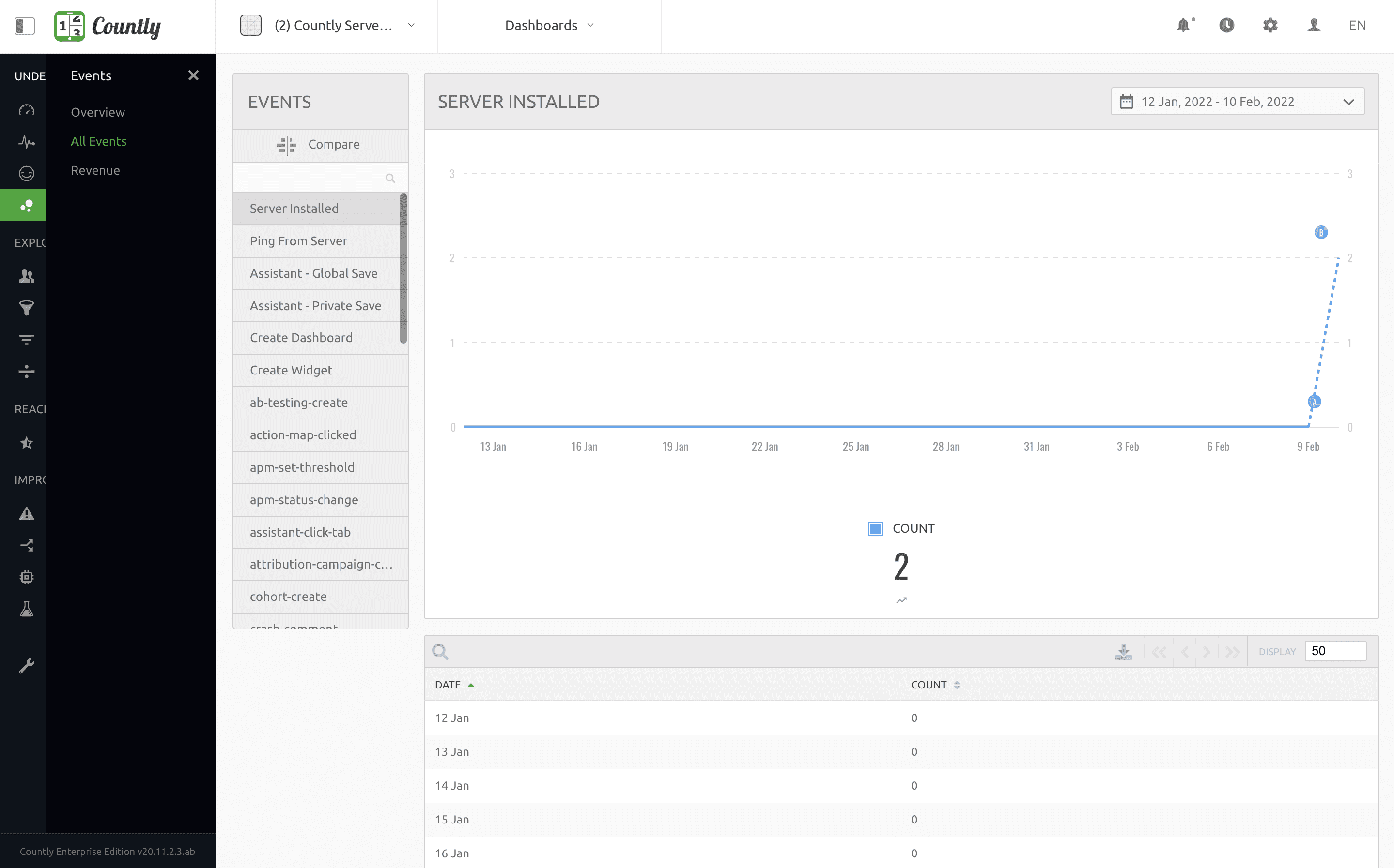
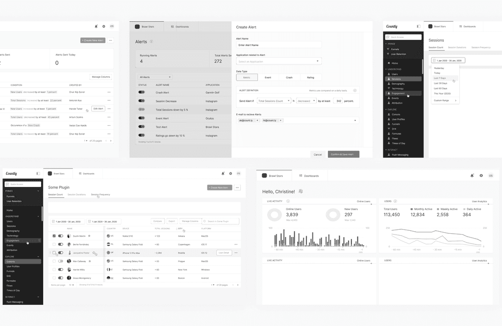
Old overview and events pages
Challenge
The outdated interface not only made look and feel worse but also created basic usability issues that hindered us from scaling the product with new features that current users demanded. As the product had a complex nature, this meant more work in a tighter deadline with our already limited resources.
Goals
Create an up-to-date look and feel
Improve usability
Build a scalable information architecture that reduces the cognitive load
Build trust and increase retention
Team
I was onboarded to the team as a product designer for the redesign project. Our head of design and I teamed up to oversee the project from its inception to its release, ensuring that the developed product remained true to our designs.
Design Process
Step 1: Analyze the current platform and identify scope
We started with auditing the existing platform, mapping areas of improvement in terms of usability, functionality, interaction, and visual elements.
Once our analysis was complete, we began collecting requirements with our product manager to define the objectives and scope of the project. As Countly did not monitor its users’ activity by policy, we decided to add user interviews to our scope, which was also our next step.
Step 2: Understand users and competitors
We decided to conduct user interviews to understand our users, since most of them are power users consisting of technical people. This meant user interviews was a fast and efficient method, as our users understand our product better, are more attentive, and have their unique ways of using our product compared to users of other non-technical platforms.
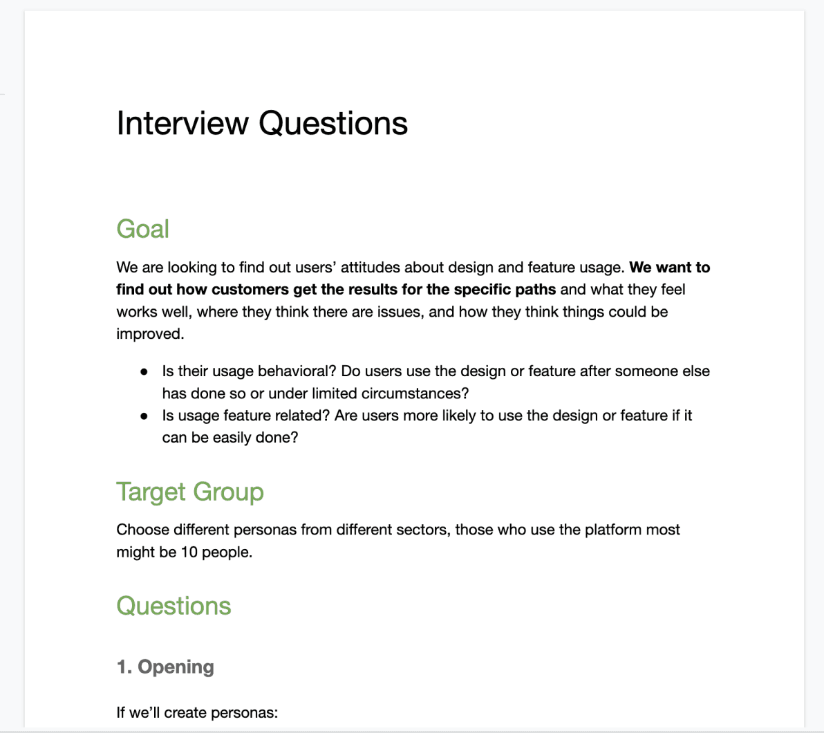
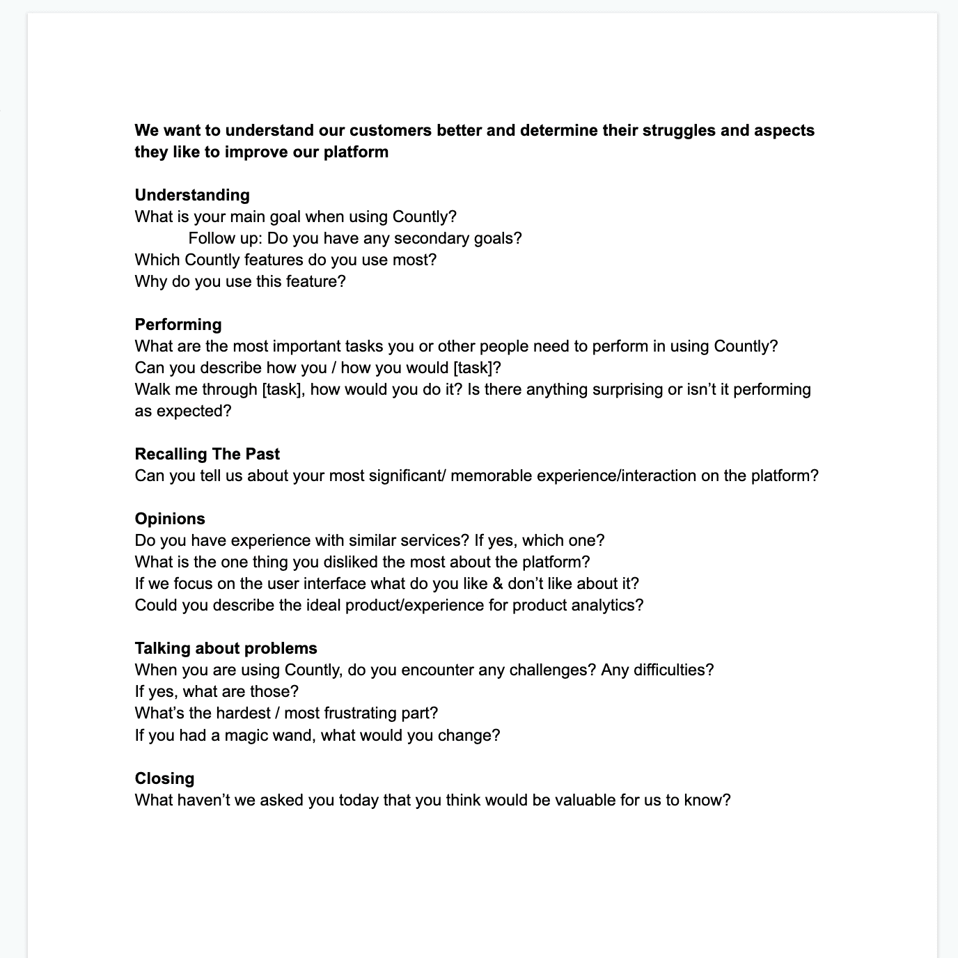
Questions for user interview
Our most critical and surprising finding was that even with their technical background, our users had a hard time understanding the features and functionality because of the information-intensive structure of the platform. This moved reducing cognitive load and informing user to the top of our priority list.
As being outdated caused a competitive disadvantage for us, next item in our scope was conducting a competitive analysis of our three biggest competitors while keeping our findings in mind.
Competitive analysis
We found out that our competitors also struggle with cognitive overload problem, as all platforms are complex and loaded with information by nature. We wanted to overcome this by making information accessible and readily available when needed creating a leveling field if not a competitive advantage.
Step 3: Ideate, design, collaborate the system
We began ideating and designing solutions addressing key insights based on our research. First, we created high-fidelity wireframes and some concept designs to determine information architecture, interaction patterns and visual language of the redesign.
First iterations of hi-fi wireframes
Our first iterations were on Sketch, but I suggested continuing with Figma. Even though moving designs to Figma meant extra effort in a time-constrained project, I was sure that it would save us way more in the long run by making collaboration between stakeholders easier and faster.
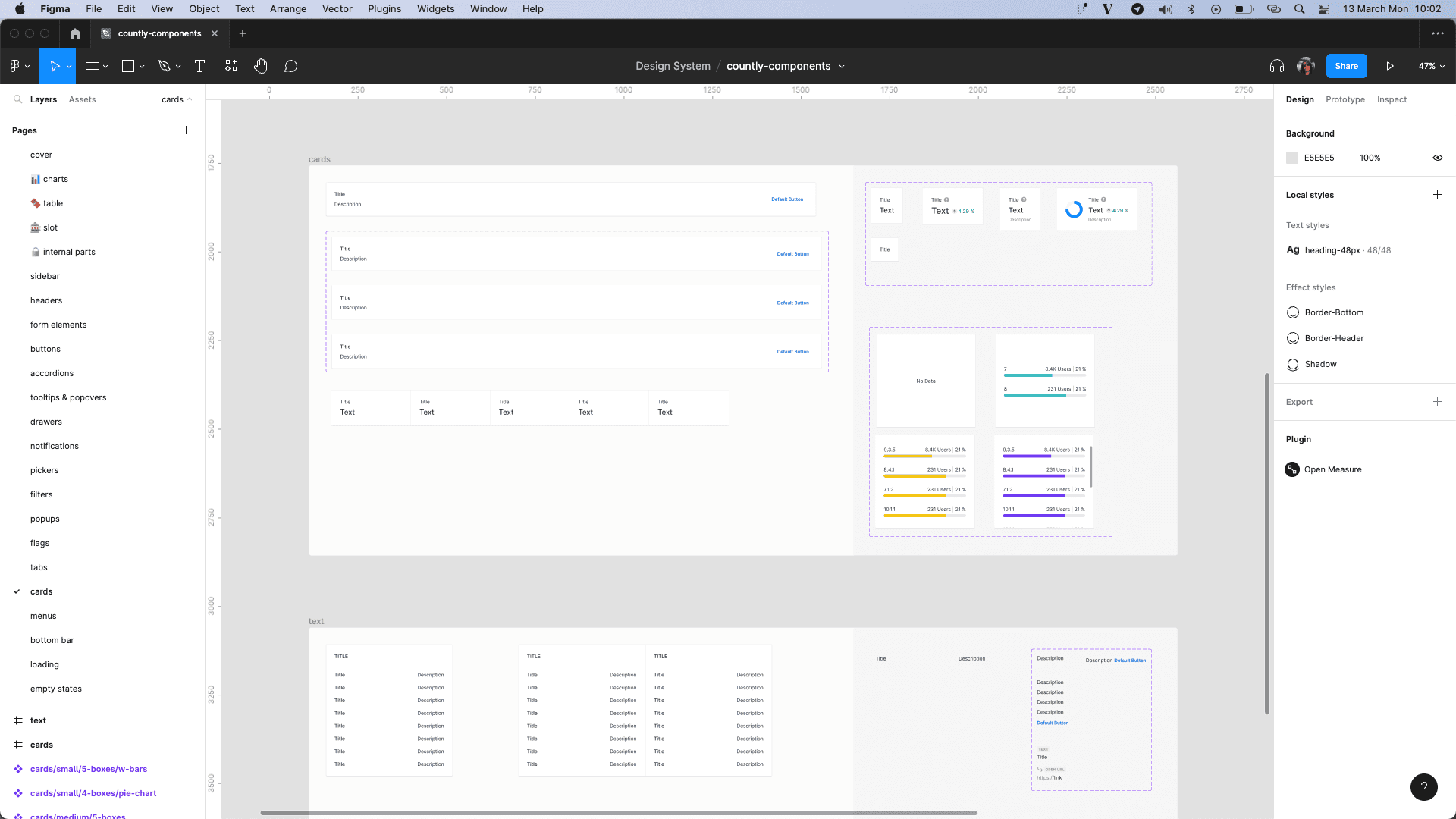
I created our design system in Figma, which enabled us to work directly with UI components, gaining us even more pace. To increase efficiency even further, I've organized our design system into three parts:
countly-foundations (icons, color, typography etc. to build components)
countly-components (components to create patterns)
countly-plugins (page patterns, complex flows, edge cases)
Screenshots from countly-foundation and countly-component libraries from Figma
Screenshot from countly-plugins file from Figma
Step 4: Ship the product
Thanks to the capabilities of Figma, handover to development was frictionless as all of our developers had already seen and collaborated with us on the designs. Once they started developing screens, we helped them with QA, ensuring that everything was working and consistent with the designs. With a successful QA phase, we, along with the development team, fixed most of the issues and shipped the product.
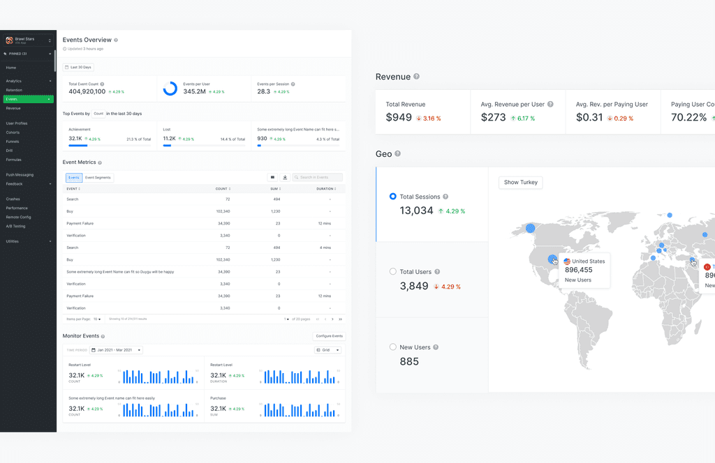
Final look of events page and revenue components
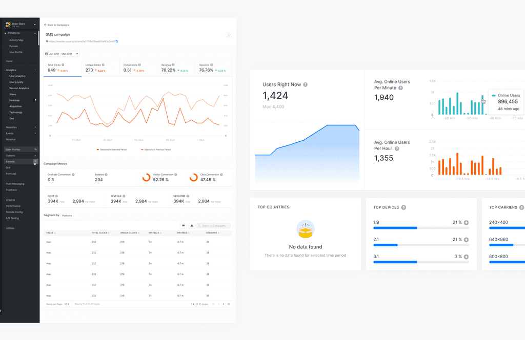
Final look of campaign detail page and different type of card components
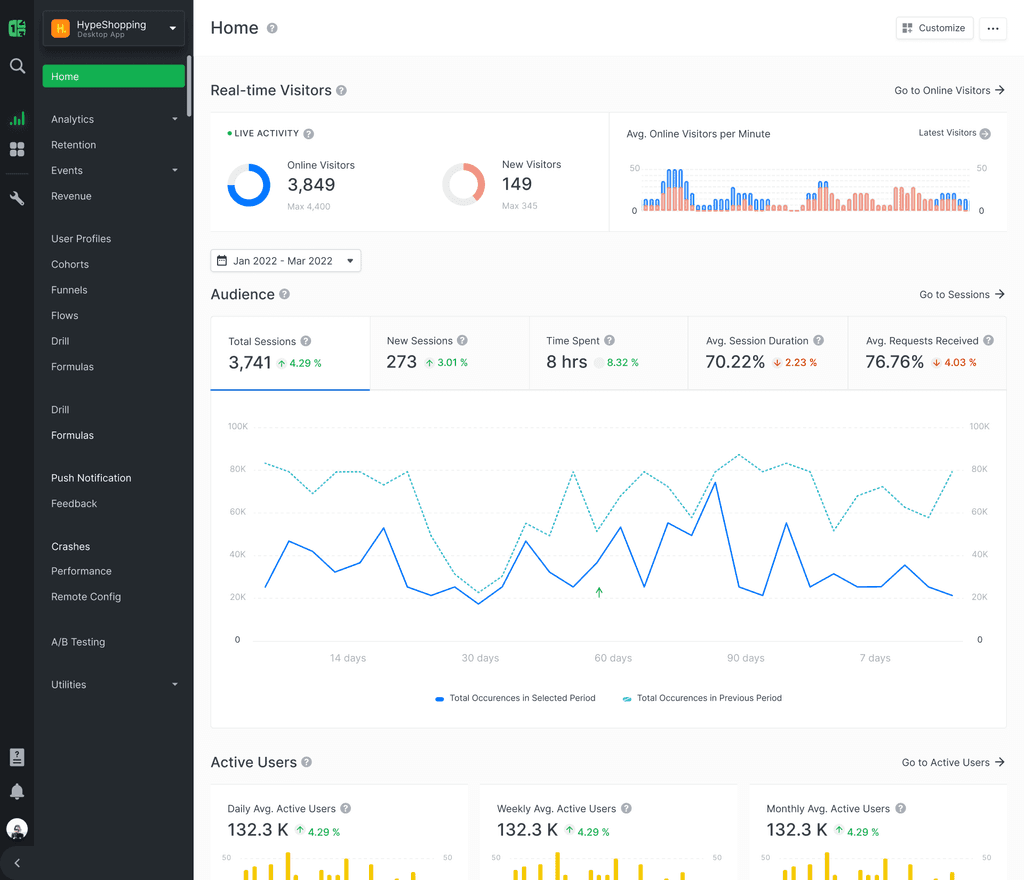
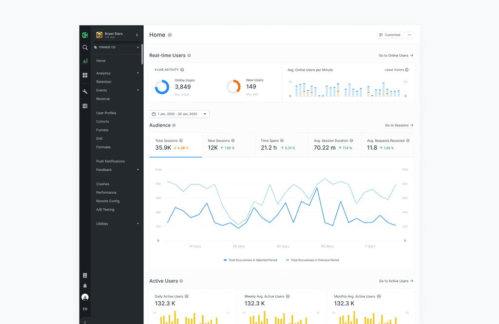
Final look of overview
Conclusion
In conclusion, it was a challenging but rewarding experience. The project was successful in achieving its goals, resulting in a redesigned platform that met the needs and preferences of the users while improving the overall user experience.
Redesigning a software interface with an existing customer base is a challenging task, but it serves as an example of how a well-planned and executed design process can lead to a successful outcome.
Want to work?
© 2024
